People love their Mac computers with a passion
for the impeccable design.
Unfortunately
after the death of
Steve Jobs in 2011,
Apple
made a number of serious technical blunders.
This page is devoted to listing them with the hopes
of getting Apple back on track before it destroys their company.
Power users are refusing to buy new produces and upgrade
older products because of these problems.
Steve Jobs explains why Apple products are getting
progressively worse.
FEEDBACK TO APPLE about Mac OS X
CALL: 1 800 676 2775 and ask to talk to a technical advisor.
-
Terminal settings LOST when files move to new computer (sometimes)?
-
Desktop locations LOST when files move to new computer!
-
Display of folders keep switching to PREVIOUS folder (list vs icon).
JUST LEAVE IT THE WAY I WANT IT!!! Do not force me to set it for EACH
folder!!!!
- LEAVE THE OBJECTS IN A FOLDER ALONE! DO NOT REPOSITION EDGES
OR FOLDER CONTENTS. JUST LET ME SET THEM AND HAVE THEM STABLE!
-
ALlow me to set the edges of a folder wherever I want them.
Stop geing asymmetrical, get out of my way so I can set up items
inside a folder where I want them.
- Put the button back that does
exec osascript << EOF > /dev/null
tell application "Finder"
if exists Finder window 1 then -- make sure there is a window to toggle
(*
Use "finder window" instead of "window" so if the front window in the Finder is an info window, the clipboard, a clipping window, etc., the script will work properly
*)
set the toolbar visible of Finder window 1 to not toolbar visible of Finder window 1
end if
end tell
Why did you remove this??????
-
Destruction of Expose and Spaces.
|
What was Expose with Spaces?
| |
|
What was Expose? Introduction by Steve Jobs (two links to the same demo)
| |
In Mac OS X 10.6.8 Expose and Spaces were near perfection (they still
had one technical flaw).
This was
destroyed by replacing it with "Mission Control".
"Mission Control" is useless for getting around windows because
all the windows overlap.
What were they thinking? The person who did this should be fired.
Reinstate Expose and Spaces!
I refuse to upgrade until this is solved.
The company binaryage has created a product that partially compensates
for this disaster:
totalspaces.
-
Spaces Technical Flaw (before it was wrecked).
The technical flaw in Spaces was that when one went a new space
and clicked on an icon in the Doc for a copy of a window, for example
Terminal.app, then nothing would happen.
One has to command-N to get the new window.
A better design
would be to create a new window for that App in that Space when
one clicks on the icon in the Doc.
-
Inability to run Java programs on my iPad.
The program
Evj runs in Java and demonstrates how information is
gained by biological systems during evolution.
Apple prevents it from running on an iPad
because they won't allow
Java on the iPad.
Apple, people bought and own their iPads!
Anyone should be able to put any software they want
onto it.
Arguments about Java being slow are irrelevant.
-
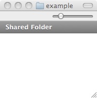
 Folder window control removed.
In Mac OS X 10.6.8
graphically opened folders have a grey button on the upper right corner,
see the example figure to the right.
This handy button was removed in
In Mac OS X 10.7. The difference is subtle. It means that when one is
working with the mouse, one need not touch the keyboard.
Switching between the two is time-expensive.
There is no reason to lose functionality!
2014 Sep 25: I found out how to make an apple script (wrapped in a
tcsh script) that will close the folder toolbar:
hidetoolbar
-
Terminal cut/paste problem
When one uses the mouse to highlight text in a
Terminal.app,
sometimes the carriage return at the end of a line is not recognized.
As a result the lines are fused together in the cut/paste buffer.
This is a bug that I have reported but it has not been fixed.
(Note 1: the
fb script, a part of this
ToolKit can be used to edit the buffer before pasting.)
(Note 2: Following my suggestion,
Apple DID make all four sides and corners of windows controllable.
Thank you!
Thank you!
Thank you!)
-
2014 Feb 10
Active program mark
The Dock shows when an Application is active with a little light
underneath.
- In 10.6.8 this is very clear.
- In 10.9.1 the Application On light is faded and impossible to see.
Apple is making things more unclear!
-
2014 Feb 10
Icon coloring ruined


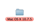
- In 10.6.8 and 10.7.5 one could mark the entire name of icons such as files and folders with colors.
This allowed one to visualize whole patches of files in a glance.
- In 10.9.1 only a small circle in front of the name is marked.
It is no longer possible to see clusters of files!
Yes, this allows the file to have multiple color marks - the circle
gets split into up to 3 parts. But those are impossible to see
easily.
Apple wasted programming effort to produce an inferior product.
-
2014 Feb 14
Activity monitor display destroyed


- In 10.6.8 the Activity Monitor could be set to display
memory usage in a circle. This was extremely useful for keeping
track of how much memory programs are using.
(Note: One can use the 'purge' command to clear unused memory!
This immediately showed up in the circular display.)
- In 10.9.1 the Activity Monitor only shows 4 useless bars.
Note:
the mem script creates a circular display of memory usage
that matches the old Apple method - but it's broken as of 2014 Feb 14.
-
2014 Feb 14
Automated moving locations of objects in folders
When I put objects into a folder that is showing
the icon view, I put them in specific locations.
However, when I download to the folder,
instead of finding an empty spot, the OS puts
the folder in the upper left corner, displacing other icons
and messing up my arrangement.
SUGGESTION: NEVER AUTOMATICALLY MOVE LOCATIONS OF ICONS IN ICON VIEW.
Just SIMPLIFY your code. STOP TRYING TO BE HELPFUL! Stupid
annoying paperclips
come to mind!
-
2014 Feb 15
Control of open folder edges
In 10.9.1 one can now control the locations of all edges of open folders
(thanks for implementing this suggestion of mine),
but sometimes one wants a smaller footprint and yet the OS prevents one
from making it as small as desired. The OS SHOULD NEVER
CONTROL THE SIZE OF THE REGION DISPLAYED. The exception is
when a person requests minimization BUT the algorithm for making
the displayed open folder
fit the items inside the folder is ruined: it doesn't find the minimum
size for the open folder that fits the icons. Why is Apple unable to program
correctly anymore?
-
2014 Feb 26
Application store text unreadable
The text of the Application Store for Software Updates is
light gray against a white background. This is difficult to read.
ALWAYS MAKE BLACK AGAINST WHITE FOR GREATEST CONTRAST!
Come on Apple, you know better!!!
-
2017 Nov 27 Grab application recenters every time one grabs.
I repeatedly capture images of scientific slides
for which
I use the /Applications/Utilities/Grab.app (found under Utilities).
In
Grab version 1.8 (117)
the "Window Grab" control pane could be placed anywhere one wants
on the screen
so I place it
out of the way of the objects I am grabbing.
In
Grab version 1.9 (138)
The control pane keeps returning to the center of the screen
COVERING UP THE SLIDE SHOW I AM TRYING TO CAPTURE.
It has to be repeatedly moved out of the way.
This is a design flaw. The control window location should
be remembered.
-
2017 Nov 27 Grab application is difficult to use.
I repeatedly capture images of scientific slides.
Grab version 1.8 (117)
and
Grab version 1.9 (138)
require that one type Shift-Command-W and then 'Chose Window'
for every image captured. This is awkward and distracting.
Worse, Command W will close the
SeaMonkey browser
or
Safari
window so if one accidentally
is switched to the browser while watching
a scientific presentation, one loses the talk entirely!
There should be a way to simply set up repeated clicks on the target
window to do multiple Grab captures.
-
Thin lines for download or play state
In the Music app and while downloading the latest operating system
there is a very thin line that shows progress.
The line is so thin that I cannot see it clearly.
This does not save anything! There is plenty of space to have
a wide and clear line!
2018 Jul 19
-
Music: hard to set volume
The volume circle must be touched EXACTLY to start changing
the volume. It can be frustrating to try to change the volume and miss
repeatedly.
Instead the circle should move to where one's finger is,
and then track the finger.
2018 Jul 19
-
iPad/iPhone contact update needs manual mode.
2018 Jul 19:
The fastest one can set the update is 15 minutes.
Sometimes this is not fast enough.
Settings/Accounts & Passwords/Fetch New Data/
has options:
Automatically, Manually, Hourly,
Every 30 Minutes
Every 15 Minutes
but what Manually does is not obvious.
There seems to be no way trigger an update.
I have my devices set to 'Push' which has the note
'New data will be ushed to your iPad from the server when possible'.
But new data does not come in quickly.
-
Source forge .xz file does not unpack properly.
2018 Sep 01:
The Xfig package at
https://sourceforge.net/projects/mcj/
can be downloaded from the page
https://sourceforge.net/projects/mcj/files/.
Once the file
https://sourceforge.net/projects/mcj/files/xfig-full-3.2.7a.tar.xz/download
has been downloaded, double clicking on it produces:
xfig-full-3.2.7a.tar.xz.cpgz
Double clicking on that produces:
xfig-full-3.2.7a.tar\ 2.xz
But the latter is IDENTICAL to the initial file!
One is stuck in a loop infinitely.
However, the command line command
tar xvf xfig-full-3.2.7a.tar.xz
immediately creates the two directories:
fig2dev-3.2.7a xfig-3.2.7a as it should.
This is a bug in Apple macOS High Sierra 10.13.6.
It is reported at
https://sourceforge.net/p/mcj/tickets/32/
-
macOS sticky windows
2018 Sep 04: Windows stick to each other and to the sides
of the desktop. This makes it difficult to move windows to where
I want them. google:
mac os sticky windows.
According to
this stackexchange page
there is no overall control.
It's just another bad decision by Apple not to allow user flexibility.
-
Preview ruins original images
macOS sticky windows
2019 Feb 12: After importing an image into Preview, one can sweep
a region and crop with Command-K. If one leaves Preview, the ORIGINAL
FILE HAS BEEN MODIFIED, ruining it. This is a very dangerous program,
as it can wreck your images.
-
Folder size/contents change
2019 Feb 12:
When one graphically displays a folder, one may set its position
and place its contents exactly where one wants.
However, the operating sytem will change the size and move the contents
ruining the organization.
The folder size, position and location of contents should be stable!
-
Folder moves
2019 Feb 12:
If a folder goes off the right edge of the screen, it moves around
when one wants to place an object into it. It is super
annoying to have it wiggling underneath one's mouse pointer.
The folders SHOULD NEVER BE MOVED BY THE OPERATING SYSTEM.
-
iTunes fail
2019 Jul 17:
Open source songs and other music should be possible to put onto
iTunes. For example,
this song. But only songs bought on the iTunes store
go to my iPhone, even if I bought them elsewhere, even if they
are open source. STOP BEING MY MOTHER!!!
-
Sticky Windows
2019 Jul 17: Windows stick to each other along the edge now.
This is NEVER how I want to position my windows. So I have
to shake them free and reposition them. There is no control for this.
STOP BEING MY MOTHER!!!! (Actually, my mom wasn't that bad!)
Example:
this song and video
-
Room sounds get picked up when recording video
2019 Jul 17: It used to be that one could record a video
directly without getting room sounds. Now when my refrigerator turns
on, the noise obscures the video I'm trying to capture.
-
Browser can control sound input
2019 Jul 19:
The input sound determined in System Preferences/Sound/Input
can be forced to a value by a browser. The user cannot
stop this! Example: hangouts.google.com . This is a security breach!
The user should be ASKED FIRST.
-
Cannot fix 'Find my iPhone' tone
2019 Jul 26:
In
Interaural time difference and how to find your phone instantly
(Published on Mar 28, 2019)
Steve Mould points out how to improve the Find my iPhone app ...
but it cannot be fixed on the iPhone.
The tone provided should be user adjustable.
-
Mail.app Flaws
2019 Oct 09:
- Since a recent (2019 or so) update of Mail.app
(Version 13.0 3594.4.19) when I highlight a mail and drag
it to a folder, I move the wrong one! It used
to show the line of email being moved so it was clear when
the right one was indicated. Now it's just a useless mail icon
during the drag. The mail that is currently highlit is NOT
the one being dragged!
- Recent mails have reduced date information. For example,
instead of giving the entire date one email says '3:10PM' What
if I don't recall which day it is? DO NOT DO THIS!!!!! IT IS NOT
MORE CONVENIENT TO GIVE LESS INFORMATION! EVER!!
- There used to be options for sorting by Date Subject, From and To.
Now (macOS 10.15) one can only sort by Date!!
- MAGICAL CONTROLS if one moves the mouse to the header region
of an email suddenly controls appear on the line between the header
and the email. NEVER HAVE INVISIBLE CONTROLS!!!!! PEOPLE MAY NEVER
FIND THEM!
- When I move a message from my Inbox to an archive, often I move the
wrong one (see above). Then I want to 'undo' and I find that it refuses
to undo! So I've moved the wrong email and now cannot figure out which one
of the (still important) emails has been moved!
- When writing an email the stupid Mail program assumes that the
first word on the left side should be capitalized. I NEVER WANT THIS!
I THEN HAVE TO FIGHT THE MECHANISM TO STOP IT.
(Generally I give up, copy into
my cut/paste buffer and edit it with my
fb script.)
It's another bad
design decision like the famous
Micro$oft PaperClip
- STOP TRYING TO BE HELPFUL!!!
-
When typing a message, Mail stupidly capitilizes the first
letter of words on the beginnings of lines. One has to go out of
one's way (i.e. switch to the mouse)
to click the 'x' to prevent it. DO NOT DO THIS!!!
STOP TRYING TO BE HELPFUL!!!! NOT EVERY LINE BEGINS A SENTENCE!
Yes, this is a repeat. It keeps on happening.
-
The ls and cp commands fail in .Trash!
2019 Oct 15: In macOS 10.15
the Terminal 'ls' command fails in ~/.Trash !!!!!
1% cd .Trash
2% ls
ls: .: Operation not permitted
3% pwd
/Users/[username]/.Trash
4% cd ..
5% ls .Trash/
ls: : Operation not permitted
6%
This is incredibly stupid!!! It is USEFUL to be able to see
and manipulate files in .Trash!!!!!
Likewise, I wanted to copy a file out of the trash to somewhere
else and was thwarted for a file starting with 'We':
% cp .Trash/We* /tmp
cp: No match.
I SPOKE TO THEM. THEY ARE WORKING ON THIS!
Status 2020 Oct 31, a year later:
1% cd .Trash
2% ls
ls: .: Operation not permitted
3%
They failed to do anything in a year. :-(
-
Popup windows must be copyable!
Apple/About This Mac provides information about the current operating
system. Some of the data can be copied, but not all at once. MAKE
ALL SUCH WINDOWS FULLY COPYABLE SO WE CAN GET THE INFORMATION EASILY!!!
-
Space/App swapping
When I click on an app icon in the dock I mean to switch to that app
IN THE SAME SPACE. However, I get kicked to some other space
where there happens to be a window of that app.
This completely disrupts what I want to do because I already
want to work in one window and now I'm in the wrong one - and I don't
even know which.
RULE: Never switch spaces when clicking on windows.
Usually if there is no window in a space I want one there,
so a new one should be made in the space I am in (optionally perhaps).
-
Feedback page is too limited.
The feedback page
http://www.apple.com/feedback/
is only for SOME Apps and there is no option for other problems
not listed!
For example, it does does not provide any link to report
the above problems with the Grab App.
-
Not responsive to customers.
When a company gets too big they stop listening to people.
This could spell the doom of Apple when other companies start
doing what Apple is not.
Alternatively, we will all start using Linux and never
come back to Apple.
The support Forums have people, possibly paid by Apple (!),
who put down suggestions and delete comments.
Really nasty.
Suggestions get lost in the forums.
PROBLEM:
Apple feedback is a black hole, suggestions are ignored and nothing
gets fixed.
SUGGESTION: Apple should keep track of the suggestions
and
TELL PEOPLE WHEN THEY ARE FIXED.
 Folder window control removed.
In Mac OS X 10.6.8
graphically opened folders have a grey button on the upper right corner,
see the example figure to the right.
This handy button was removed in
In Mac OS X 10.7. The difference is subtle. It means that when one is
working with the mouse, one need not touch the keyboard.
Switching between the two is time-expensive.
There is no reason to lose functionality!


