(eps)

These are photographs of Science Fair posters by R. Michael Stephens (1990) and Nate Herman (1991). The original posters were accepted by the NIH Museum. Unfortunately the museum found that they were moldy and could not be preserved. So this archive is the only record of them.
Mike Stephens was my first high school student and Nate Herman my second.
My first SIP student, Mike Stephens,
published two
papers with me:
article{Schneider.Stephens1990,
author = "T. D. Schneider
 and R. M. Stephens",
title = "Sequence Logos: A New Way to Display Consensus Sequences",
journal = "Nucleic Acids Res.",
volume = "18",
pages = "6097-6100",
year = "1990"}
and
@article{Stephens.Schneider.Splice,
author = "R. M. Stephens
  and T. D. Schneider",
title = "Features of spliceosome evolution and function
inferred from an analysis of the information at human splice sites",
journal = "J. Mol. Biol.",
volume = "228",
pages = "1124-1136",
year = "1992"}

(eps) |
Origin of Sequence Logos
Mike entered a science fair describing his work
on human splice junctions and won in it.
The significance of the poster is a
figure where Mike marked the
'consensus sequences' of human donor and acceptor splice junctions on
a table of the numbers of each base at each position.
We were
surprised to observe that these two consensus sequences are the same.
Above these tables we showed the information content and it is
different. How could two sites have the same 'consensus' and yet be
different? This puzzle led us to invent
sequence logos, so it has
some historical significance.
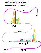
In the figure to the right are the logos for the donor and acceptor
sites. You can see that the consensus is the same but that
the emphasis is different. To understand the interesting
biological significance of this observation,
you can
read the paper.
There are
two science fair posters from Nate Herman who published
this paper with me:
@article{Herman.Schneider1992,
author = "N. D. Herman
  and T. D. Schneider",
title = "High Information Conservation Implies that at Least Three
Proteins Bind Independently to {F} Plasmid \emph{incD} Repeats",
journal = "J. Bacteriol.",
volume = "174",
pages = "3558-3560",
year = "1992"}
These have some of the earliest
sequence logos.
![]()

Schneider Lab
origin: 2007 Aug 28
updated: 2014 Mar 06
![]()