Create a blank page
Select File > New.
You can create a page that contains a pre-designed CSS layout, or create a completely blank page and then create a layout of your own.
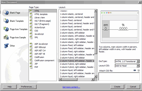
In the Blank Page category of the New Document dialog box, select the kind of page you want to create from the Page Type column. For example, select HTML to create a plain HTML page, select ColdFusion to create a ColdFusion page, and so on.
If you want your new page to contain a CSS layout, select a predesigned CSS layout from the Layout column; otherwise, select None.
Based on your selection, a preview and description of the selected layout appears on the right side of the dialog box.
The predesigned CSS layouts provide the following types of columns:
Fixed Column width is specified in pixels. The column does not resize based on the size of the browser or the site visitor’s text settings.
Elastic Column width is specified in a unit of measurement (ems) relative to the size of the text. The design adapts if the site visitor changes the text settings, but does not change based on the size of the browser window.
Liquid Column width is specified as a percentage of the site visitor’s browser width. The design adapts if the site visitor makes the browser wider or narrower, but does not change based on the site visitor’s text settings.
Hybrid Columns are a combination of any of the previous three options. For example, in the two-column hybrid, the right sidebar layout has a liquid main column that scales to the size of the browser, and an elastic column on the right that scales to the size of the site visitor’s text settings.
Dream Weaver - Brockville, Ontario [Java Applet: PixAround PixScreen]