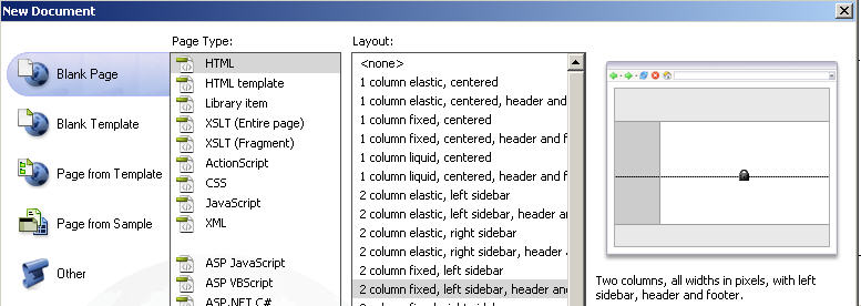
DW CS4's pre designed CSS layouts
There are wavelengths that people cannot see,
there are sounds that people cannot hear,
and maybe computers have thoughts
that people cannot think.
Richard Wesley Hamming

The pre designed CSS layouts provide the following types of columns:
- Fixed
- Column width is specified in pixels. The column does not resize based on the size of the browser or the site visitor’s text settings.
Example - Elastic
- Column width is specified in a unit of measurement (ems) relative to the size of the text. The design adapts if the site visitor changes the text settings, but does not change based on the size of the browser window. Example
- Liquid
- Column width is specified as a percentage of the site visitor’s browser width. The design adapts if the site visitor makes the browser wider or narrower, but does not change based on the site visitor’s text settings. Example
- Hybrid
- Columns are a combination of any of the previous three options. For example, in the two-column hybrid, the right sidebar layout has a liquid main column that scales to the size of the browser, and an elastic column on the right that scales to the size of the site visitor’s text settings.
Example
You might also enjoy Adobe's Dreamweaver starter templates and Learn to work with CSS.
** Home ** Class
Pages ** Site Map **
David J. Hark
HARK/INTERNET-HELP, Inc.
P. O. Box 201 Shepherdstown, WV 25443-0201
304-876-2607
N8GMQ
dhark@fred.net
http://www.dhark.com
http://www.fred.net/dhark
Last updated: 24 August 2009
© 2009 David J. Hark